Helplinks are small icons ? displayed in various places within the system — next to form fields, beside buttons, next to section headers, or in settings. When clicked, a tooltip appears with a brief explanation, and the arrow ››› leads to the full article in the Knowledge Base.
Helplinks are effective wherever users may need contextual help — they explain in a few sentences what a given field or function does, without the need to leave the current page.
Access Path
Knowledge Base → Helplinks
How does it work?
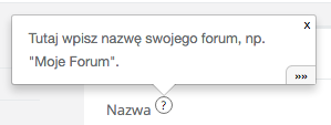
- An icon ? is visible in various places within the system.
- Click it — a tooltip will open with a brief explanation of the element.
- Click the arrow ››› at the bottom of the tooltip — you will be taken to the full article in the Knowledge Base, directly to the relevant section.
Managing Helplinks
Helplink States
Administrators see helplinks in three states:
- Blue — active, with content. Visible to all users.
- Red — active, but without content. To be completed.
- Yellow — inactive. Hidden from regular users.
Regular users only see blue helplinks.
Automatic Creation
Helplinks are created automatically (as inactive) upon the first display of a page with a helplink element. You do not need to create them manually — the system will detect them, and the administrator will complete the content and activate them.
Helplink List
In the view Knowledge Base → Helplinks, you will find a list of all helplinks. Each displays:
-
Key — unique identifier (e.g.,
crm_client_name) - Content — preview of the text from the tooltip
- Entry — related article in the Knowledge Base
- Opens — how many times users have displayed the tooltip
- Clicks — how many times they clicked the arrow to the full article
Statistics help determine which helplinks to complete first — sort by the number of opens.
Editing a Helplink — Field Descriptions
Active
Enables or disables the helplink. Only active helplinks with content (blue) are visible to regular users. Inactive (yellow) are only visible to the administrator.
Knowledge Base
The Knowledge Base to which the helplink belongs. The helplink is only displayed on pages related to the selected base.
Entry
The article in the Knowledge Base that the arrow ››› at the bottom of the tooltip leads to. Choose the entry that best describes the helplink’s topic.
Section
Anchor to a specific section in the related entry. This allows the arrow ››› to take the user directly to the appropriate place in the article, not to its beginning. Sections correspond to headers (h2–h5) in the entry.
Key
Unique identifier of the helplink (e.g., crm_client_name). The key links the element in the interface (e.g., form field) to this helplink. Keys are generated automatically in the format module_object_field.
Content
Text displayed in the tooltip after clicking the icon ?. It should be concise (1–3 sentences) and immediately answer the question “what does this field do?”. You can use basic formatting (bold, lists, links, images).
Tips
- Write concisely — the content of the tooltip should fit within 1–3 sentences. Leave details in the Knowledge Base article.
-
Link to sections — use the “Section” field with the anchor (e.g.,
#client-name) so that the arrow ››› leads to a specific place in the article. - One entry, multiple helplinks — several helplinks can lead to different sections of the same article (e.g., 30 CRM helplinks lead to one entry about the client card).
- Complete the most popular — helplinks with the highest number of opens are those where users most often seek help.
Older version of this article (Sugester 1): Helplinks — hints/tooltips displayed on your page